
First impression
Opening up the Neiman Marcus website, I didn’t know what to expect. I’m sure most people would assume to see an array of chic and sophisticated imagery, with an assembly of designer names displayed in front of them…after all they are one of the leading luxury retailers. Since I can’t remember the last time I browsed their website, I decided to go on a Neiman Marcus journey to see what they had to offer.
Initial reaction = overwhelmed. Right away there was a large promotional banner that took up a majority of the screen and changed the images in a slideshow manner. This might have been fine, if there weren’t a million other things going on below the banner. There were a multitude of images that linked to everything from MasterPass by MasterCard to an Elie Saab look book. I kept losing focus as I scrolled down because the images were clumped together, promoting a variety of different things. Having a clean and organized look is more beneficial because customers are more likely to stay focused on what they came for initially. For instance, the Michael Kors website displays a minimal amount of large, eye-catching images and an impeccably organized menu so you don’t feel overwhelmed by options.
Another overwhelming factor in this process was their CRM program. Once you sign up, they send you multiple emails per day. If you’re trying to opt out of receiving emails… good luck! It takes forever to opt out of their email program, leaving you with an inbox filled with nothing but an abundance of Neiman Marcus.
Finding my way around
The first thing I noticed on the mega menu was a smaller version of the promotional banner following me around throughout the different categories. The banner was inconsistently placed on the site and there were even different variations of it. Once again, distracting. The Neiman Marcus mega menu is extremely vast and is almost broken down too specifically. In the Designers category alone, they have it broken up into Designers by Category, Featured Designers, Designers by A-Z, or View All Designers. It would be easier to digest if they consolidated the “Featured Designers” list and then had the “View All Designers” as the only other option displayed. The Barneys site is a perfect example of having a clean and clear menu. I love the font they use, because even though it’s small, it’s readable and categories are separated enough that they don’t look forced into one place. It’s just all-around pleasant to look at, and easy to navigate.
The myNM category in the left hand corner was my favorite part of the menu. For those who didn’t notice from my last blog post, I love when retailers add personalization to their websites. If you are a frequent Neiman Marcus shopper, there’s really no reason not to take full advantage of their customized options. NM sets up your own homepage in which you can browse different sections that are tailored specifically for you. For instance, Just For You, You May Also Like, New Since Your Last Visit and even Most Requested in [Dallas] are just a few of the different sections that are geared towards finding your perfect items! It’s honestly the next best thing to having a personal stylist.
Product information
After locating a product I was interested in, I was lead to the product detail page. Once I expanded the details, I found that the entire details box overlaid on top of relevant content – such as the title and price – hiding information that would greatly influence my purchase decision. Another thing I noticed was that none of the PDP pages had product reviews. According to iPerceptions, “63% of customers are more likely to make a purchase from a site that has user reviews.” Knowing this makes me question whether or not Neiman Marcus values their customer’s opinion.
While I loved the interactive videos that show how the fabric moves and the “You May Also Like” options, I thought the details and sizing section were misleading. For instance, in the NM kids category they have two different sizing drop downs based on toddlers or girls. Why not just have one, considering it’s the same item? There was also an unnecessary drop down option for “Select Color” even if there were no other color options available. I prefer product detail pages like this because it’s straightforward, yet you still feel well informed.
Neiman Marcus has a ton of different sizing guides, and it can be confusing to know if you’re choosing the right size. I would love to see True Fit sizing on the Neiman Marcus website, because it’s something I really love using on retail sites like Nordstrom. The True Fit Sizing option is so beneficial because you can create a custom profile based on questions about your body type. It rates whether or not the clothing you selected would be a good fit for you and what size you should purchase. True Fit sizing is wonderful for large retailers because there are so many different designers, and with each one comes a different type of fit.
Checkout process
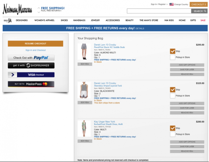
After I got through making my purchase decision, I was lead to my “shopping bag,” but I couldn’t figure out how to check out! There was no way to purchase my items…was this even a cart? Lo and behold, the guest checkout button was on the left-hand side. Not only was this the opposite position of most cart buttons (and obviously confusing) but it was also displayed in their gold color, which is hard to see. Aside from that, Neiman Marcus offers the option of picking up in-store or free two-day shipping, which is an added bonus.
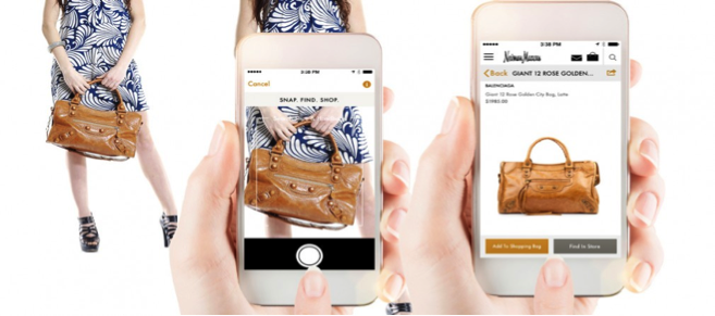
My favorite part of the Neiman Marcus experience was using their “Snap. Find. Shop” app. There have been many times where I’ve seen an item that I just couldn’t live without, but it was either discontinued or nowhere to be found. Coming from a true shopaholic, this can be quite depressing. I always thought to myself, Wouldn’t it be cool to be able to take a picture of the item you wanted, and have similar options come up that you could purchase? Well, the shopping gods at Neiman Marcus have answered our prayers, and with one snap you are not only able to find similar items to your product but you can purchase them right then and there. Below is an example of the process.
These were some of the things I found that could potentially create a more seamless customer experience. And apparently I’m not the only one to have strong opinions about Neiman Marcus. Our Principal & Creative Director, Phill Carpenter, is a long time Neiman Marcus customer and will follow up in a few weeks with his recommendations for improving the NM customer experience.
Have you had your own online shopping experience with Neiman Marcus? If so, we’d love to hear about it in the comments below.
