
When I first began building responsive websites, it was a learning process filled with many unknown unknowns. Every project that was deemed worthy of being pimped out responsively would send a quick wave of excitement over me. I loved the challenge; each project provided an opportunity to learn something new that could be carried over into the next one. To be honest, there were several times when that feeling of excitement transformed into fear as I navigated the deep waters of responsive design. But over time, best practices emerged from the web community, countless frameworks were built (and are still being built) and after years of practice, many of those unknown unknowns became known knowns.
A new challenge
The gift and the curse of working on the web is that it is constantly evolving. New devices, tools, technologies and techniques have emerged rapidly and are bringing on new sets of challenges.
Today, one of those challenges is meeting users’ high expectations for mobile web performance.
- 66% of smartphone users expect pages to load in 4 seconds or less. [source]
- 40% of mobile users say they will abandon a page that takes longer than 3 seconds to load. [source]
- 85% of mobile users expect pages to load as fast as or faster than they load on the desktop. [source]
Most of us in the web community are aware of the negative impact slow web pages have on a user’s experience, but we still aren’t doing a good job. As we continue to create richer experiences for our users, web pages continue to balloon in size, page load times continue to rise and users continue to remain unsatisfied. Although there are a number of mobile performance factors that are completely out of our control – such as unpredictable mobile network speeds, usage patterns and hardware – let’s focus on the things we can control in order to improve the speed of our web pages and meet users’ expectations.
Reduce page weight
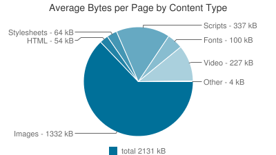
Page weight is the total file size of HTML, CSS, JavaScript, Images, Webfonts and other content that makes up your site. The smaller the page weight, the faster your page will load. According to HTTPArchive, the average page size is currently 2,131KB and continues to climb each month. Here’s a breakdown of where the fat is coming from:
Ways to improve:
- Build mobile first: Deliver styles for small screens first and use progressive enhancement to add content and functionality as screen sizes get larger.
- Avoid CSS bloat: Create reusable CSS by focusing less on styling individual pages and more on styling universal components that will be shared throughout the site. Less styles = less page bloat = less page weight.
- Optimize images: Images make up the largest percentage of page weight. Be sure to use proper image formats and slightly reduce the quality of your images before you export them. Run your images through an optimizer tool like Imageoptim to compress your images even more.
- Minify your text files: Minification reduces the size of your files by removing unnecessary characters like comments and whitespace from your code.
- Enable gzip on your server: This will further compress text files.
Minimize request
When you type a URL into your favorite browser and hit go, your browser begins making requests to a web server for the assets it needs to load (things like HTML, CSS, JavaScript, Images, Webfonts and any third-party scripts). The server processes each request and sends it back to the browser and a page begins to load and become usable. Currently, the average web page makes over 100 requests! You can improve the page load speed of your site if you can reduce the number of requests that your web page needs to render.
Ways to improve:
- Concatenate files: Merge all of your CSS and JavaScript files into one single CSS and JavaScript file so they require only one HTTP request.
- Look for opportunities to inline SVGs: Eliminate the need for the browser to make a request to the server for an image asset.
- Use CSS instead of images: Translate design elements when possible, including gradients, shadows and hamburger icons.
- Eliminate 404 errors: They represent an entire round trip from browser to server completely wasted.
- Cache assets for returning users: That way the browser avoids the need to request assets on subsequent visits.
Focus on perceived performance
The perception of how fast your site feels is more important than how fast your site actually is. A user’s perception of speed will be based on how fast your site’s content becomes visible and useable to them rather than when your page has fully loaded.
Ways to improve:
- Use progressive JPGs: In place of standard baseline JPGs, users receive a pixelated image quickly and it gradually enhances until it reaches full quality. Progressive JPGs give off the impression that they load faster.
- Inline critical CSS: CSS files block the rendering of your page until they are completely downloaded. When possible, inline the CSS critical for rendering the initial view and load the remaining styles in a non-blocking way.
- Load JS files at the end of the page and asynchronously: JavaScript blocks the rendering of your page unless it is declared as asynchronous.
- Deferred content loading: Scan your page for content that is not critical to its primary purpose. This content is game for loading with JavaScript after the initial page load.
As users increasingly become more mobile, their demands for a faster experience will continue to grow louder. I’ve given you a few things you can do to meet these demands for faster websites; now it’s up to you to accept the challenge.
Have other tips or best practices you want to share? Let us know in the comments below.
